Select Harvest
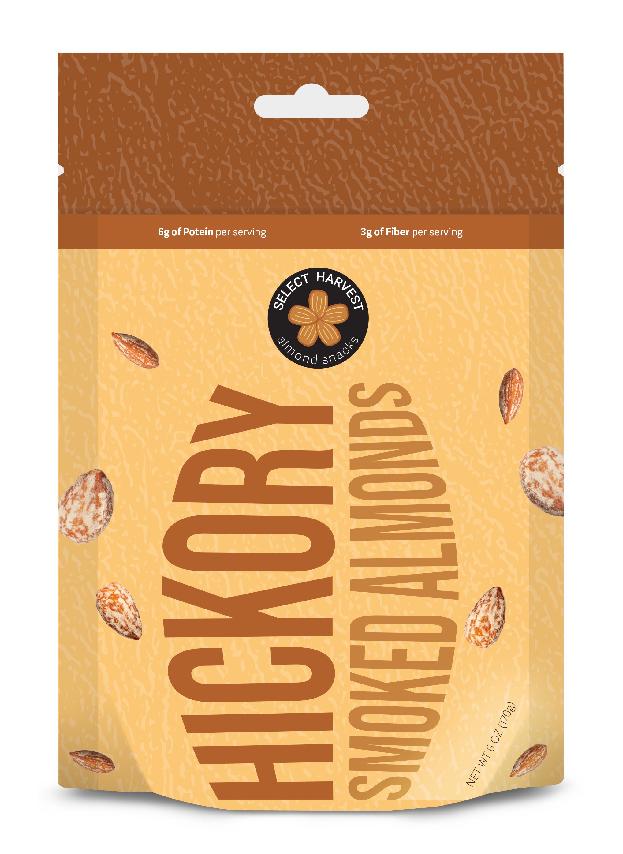
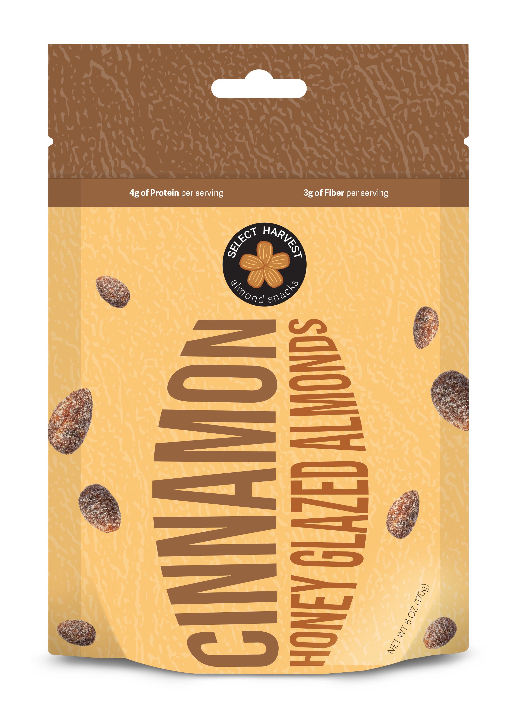
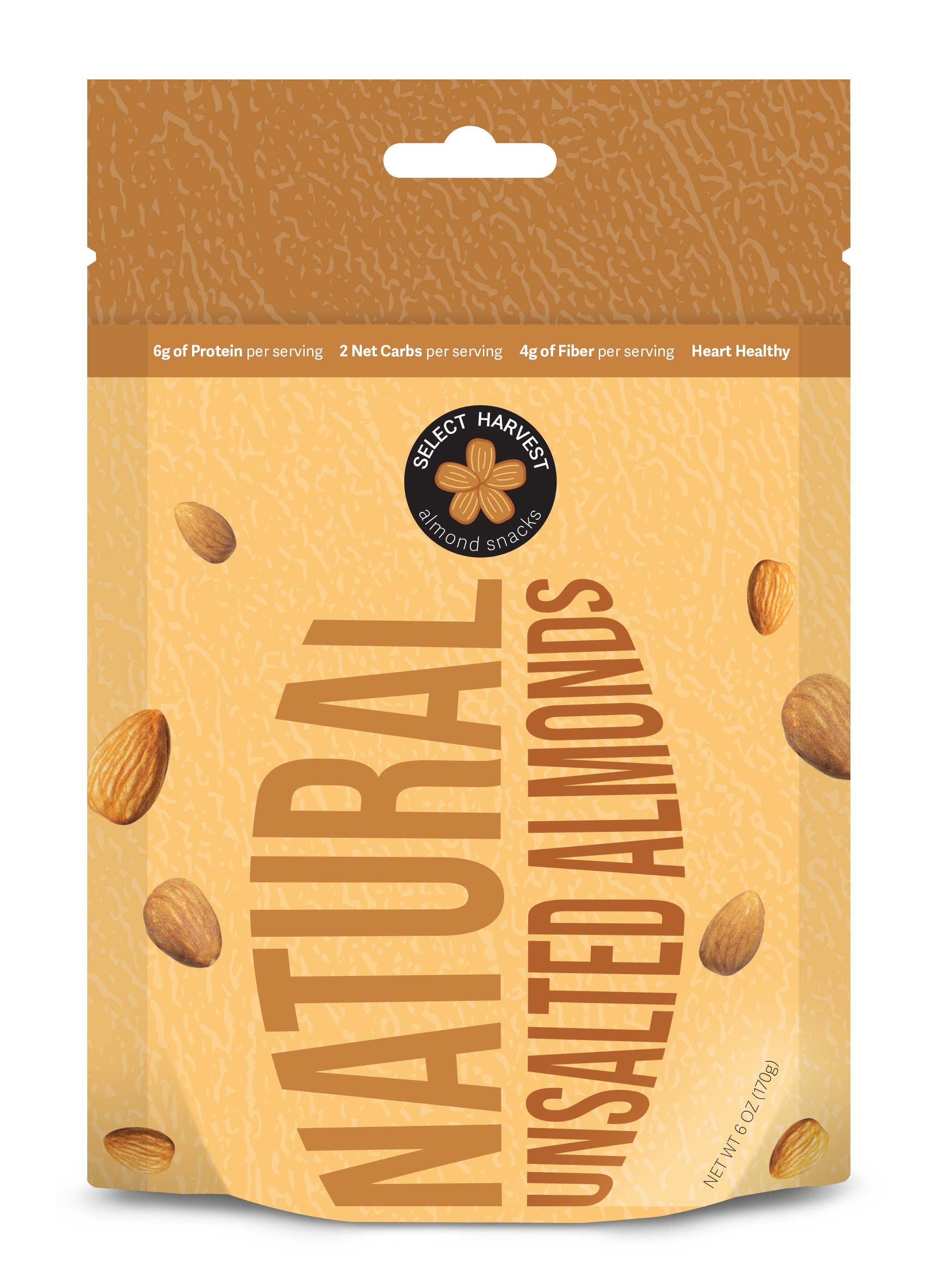
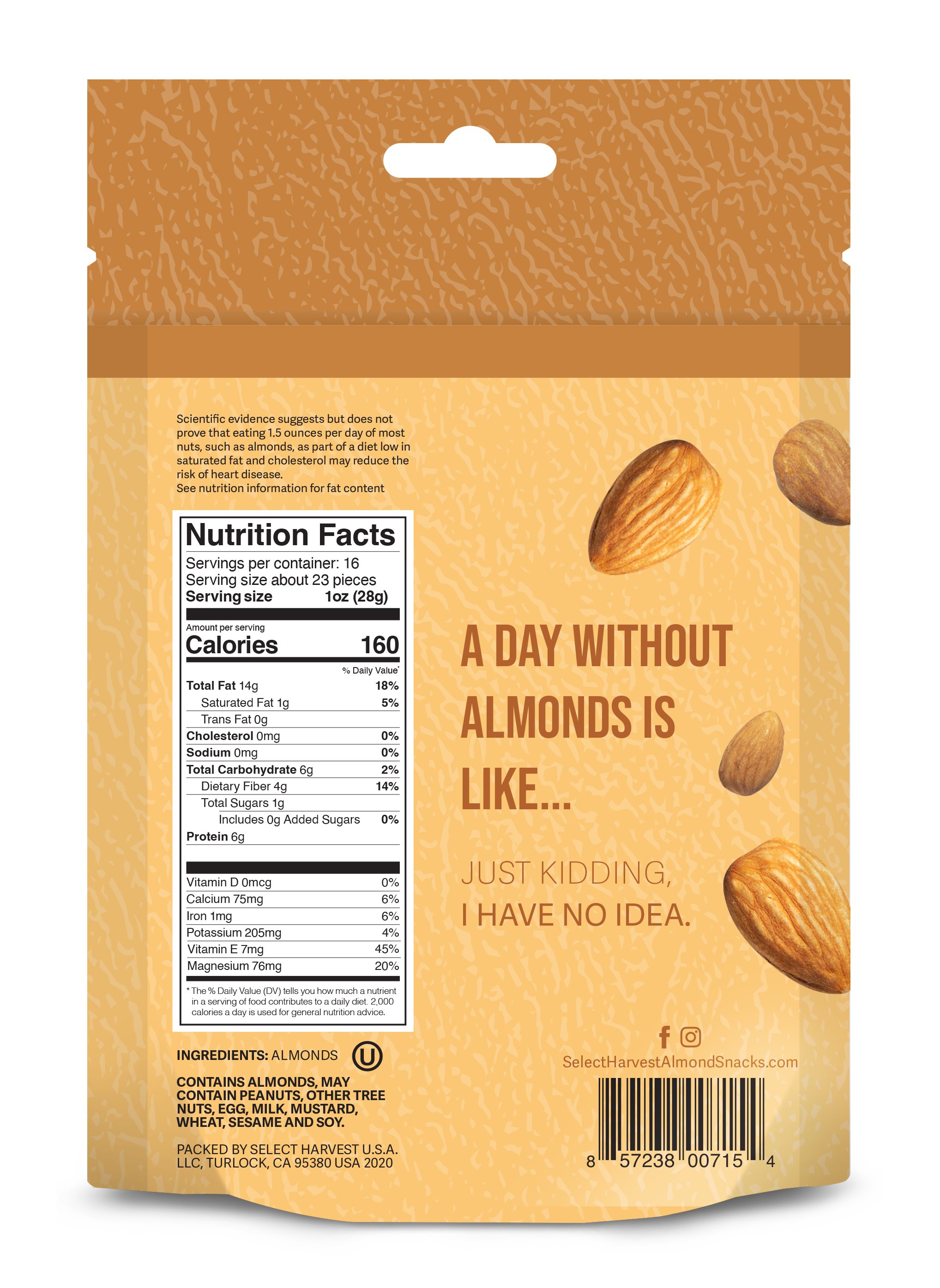
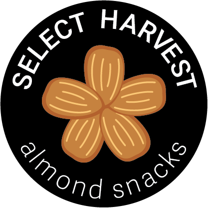
This brand identity is a rebrand for Select Harvest. The concept for this brand is to be playful, have a sense of movement, and portray an inclusive design for both females and males. The composition of the almonds on the logo resemble the stages of almond growth. This being that almonds from from a flower. To create a visual emphasis on the logo, the black circle stands boldly against the yellow packaging. The varied flavors on the packaging are composed in a way to look like an almond and its horizontal layout is intended for the consumer to interact with the product.
